Design Intervention:
App interface for the T in Boston
The instructions for this assignment was to design an interactive experience to improve a common issue when using the T. As a frequent user of the green line, especially the overground Northeastern stop, I decided to apply my confusion with the “request stop” method of the T, as well as the CharlieCard kiosks at stations. When the assignment was introduced, I immediately knew some of the hardships I wanted to focus on. In fact, it was only after about a year since moving to Boston that I found out the yellow strips on the interior of the trains affords pressing, since there are no signifiers. Because many students already use navigation apps, I wanted to combine navigation with procedures specific to the T for convenience, efficiency, and reliability.
Key features:
Adding funds to mobile CharlieCards
navigation, and “request stop” button
Final prototype created in Figma

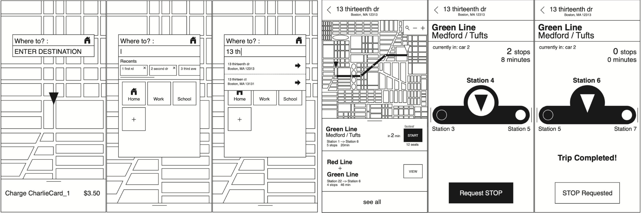
Homescreen: User can swipe up the bottom panel to manage CharlieCards They can change language and turn on/off notifications. When the Home icon is pressed, the app automatically finds routes to the user's home from their current location.

Search: Like other navigation tools, the app finds most optimal route to destination with basic information such as ETA, distance, and details about the T they should take

Charge CharlieCard: parents / guardians can manage the funds of their dependents' CharlieCards who may be unable to do so themselves. On the right, the user can notify the app that they are on the train that they were tracking so that the app can accurately track both the train and the user, as well as the time estimates.
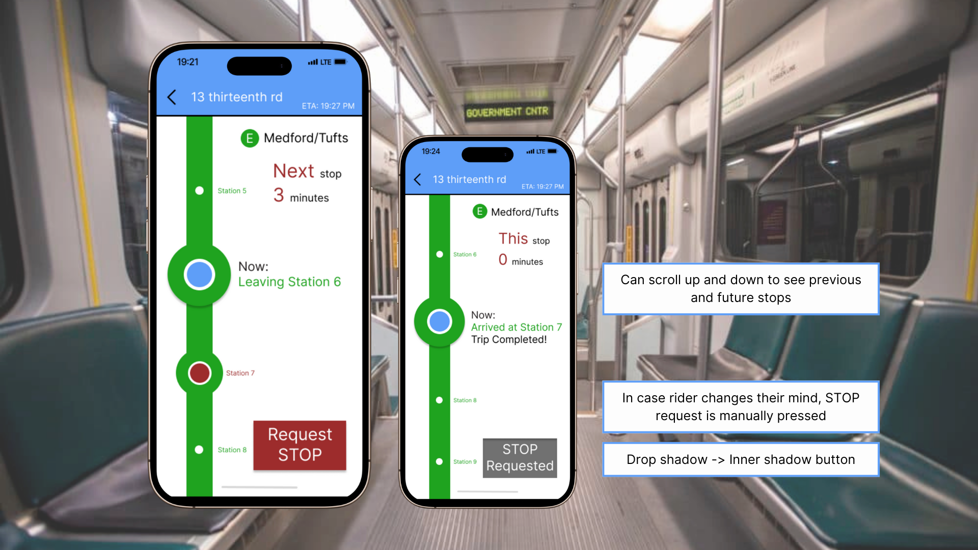
On the train: User can track their location, ETA, distance from destination, and have the ability to request stop when they desire
Research

Finding Noticeable Problems
‘Request Stop’ button
The strips lack visibility
Not many people know to press on it to request stop for overground stops
Unreliable
Map apps aren’t always accurate
Times displayed at the stops are not always right
Often too crowded to get on
Not enough seats at station
Not clear where the train will stop
and where people should stand to wait for the train
CharlieCards are reloadable only at stations with the kiosk
hard to navigate screen; confusing for first-time users/tourists
Sketches
What was the process?
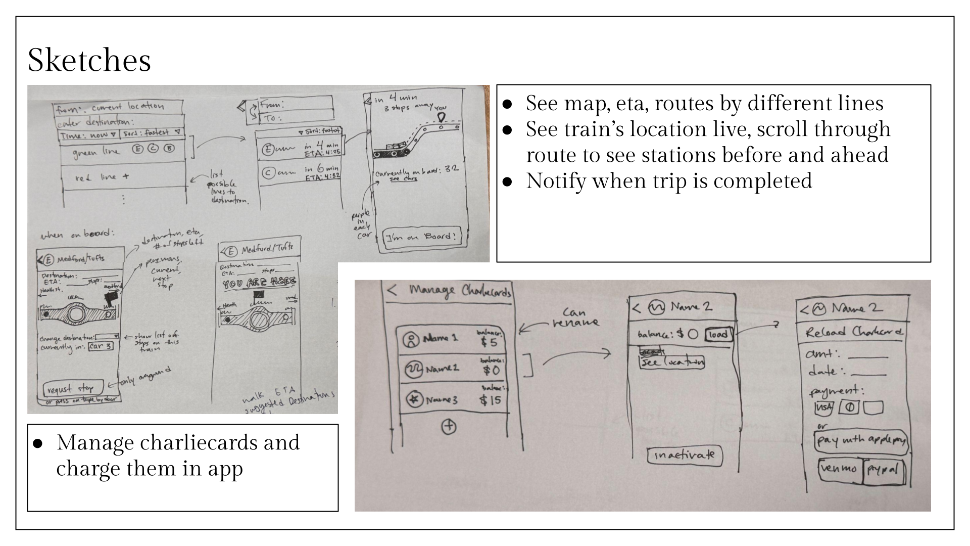
Sketches on Adobe Illustrator